


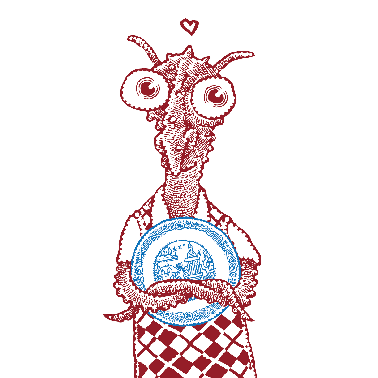


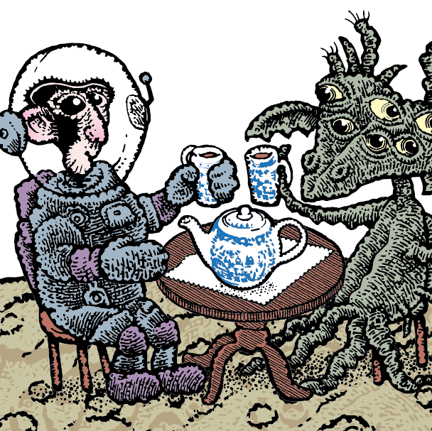
In February, as the global epidemic got rolling, I was working on an image of an astronaut and alien having tea. I like the way it celebrates hospitality in a time of isolation and social distancing.
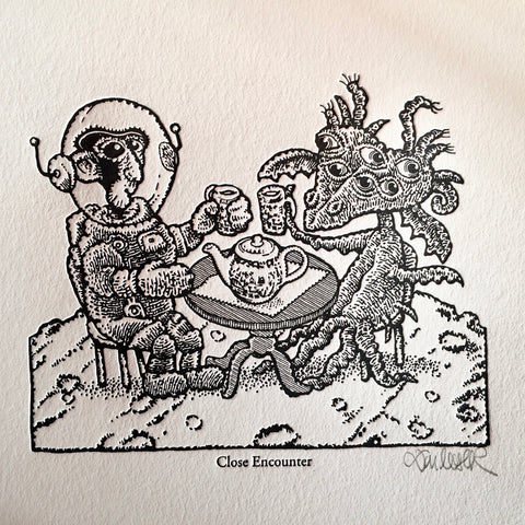
This design became a limited-edition letterpress print (all gone). And is now the banner image on the home page of the Calamityware store.
How the sausage is made. Because some of you like to see how a design is developed, I thought I’d share some details of how this image progressed. I have often written about how the design process is a stumbling, bumpy journey with lots of backing up and redoing. This small project is another example of that fact. In my experience, any creator who claims he or she advances in a majestic, straight line is lying to you.
********
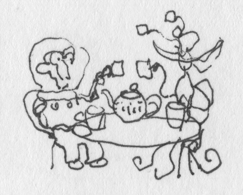
Humble beginnings. This little doodle (one inch wide) in my pocket sketchbook was the first sketch of what became the Close Encounter letterpress print.
All the main elements are there—ape astronaut in space suit, table, tea pot, alien with multiple eye stalks. Problems? For some unexplained reason, a second set of mugs sits on the table and the table levitates magically without any base. And the whole scene is floating with no ground to support the action.
Why an ape? First, you’ll recall that apes went into space before human beings. Second, I subscribe to the vintage notion that apes are inherently funny. Third, at the point when I started this drawing, I had just finished the Apes and Aliens jigsaw puzzle design, so apes filled all my sketchbooks and I wasn’t quite ready to move beyond them. (These puzzles will be in this store in July. Sign up to receive email notification here.)
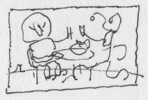
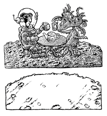
This later sketch is also only one inch wide. It fits the action in a rectangular frame and adds the planet surface for objects to rest on. The idea is complete at this point. The rest is just inky details. And all these details are things I like to draw—apes, space suits, porcelain, aliens with tentacles, and the lumpy surfaces of exotic planets.
********
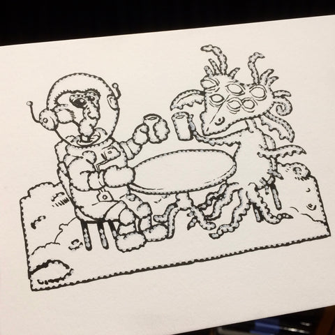
This is the first outline drawing of the characters and props. There’s a chance at this point to make major corrections before any stippling or shading.
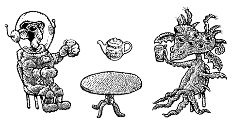
I drew the characters and props as separate elements, added shading, and then assembled them into a composition. That approach makes it easy to change scale and adjust the positions of the actors without redrawing everything.
********
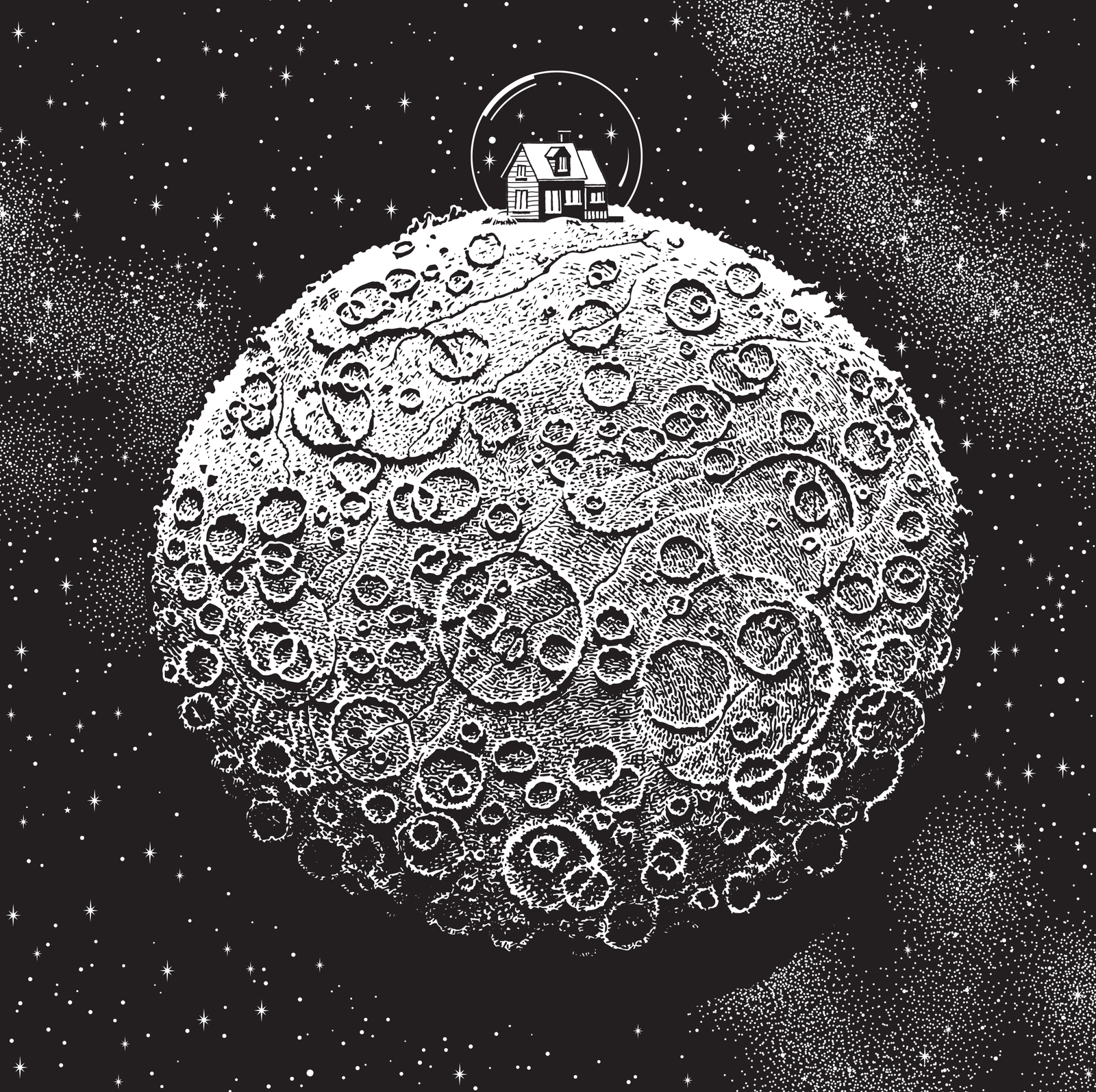
My first version of the planet’s surface was detailed with lots of craters, fissures, and shadows. Drawing craters is always great fun, but when I saw it in place, I realized this detail was distracting from the tea party. So I drew a new version of the planet with less detail.
********
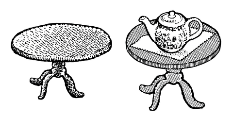
The first table that I drew was a little too coarse. It looked like it was hand carved out of a block of cheese. I thought it would be funnier if the tea table looked more like a refined antique, so I redrew it with fine parallel lines and added a doily under the tea pot. Better.
********
Later, after I had signed the letterpress prints, I added color to the image so it could serve as the banner for the home page of the Calamityware website. At that point, I added another layer of texture to the planet’s surface. Done.
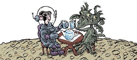
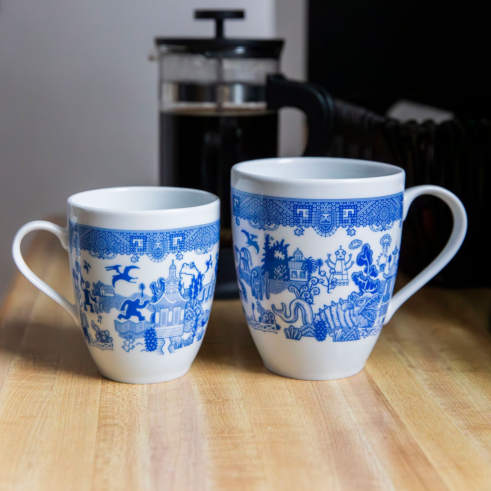
I like this image because it’s pleasant to see amiable creatures enjoying a congenial break together. We need more of that in our universe these days. (I also like the mugs and teapot.)
Don—Pittsburgh, June 25, 2020


Gwen Harada
July 27, 2020
Don, Lynette and Jack,
Thank you so much for the gift of “Close Encounters” note/giftcards: I love the hilarious absurdity of two unlikely characters taking tea, one of my favorite pastimes. All of the comments are solid and I agree with them. I’ll order more giftcards to share. I look forward to this image on tees; I hope in time for Christmas buying.